Uncovering the forces driving costs in Canada’s public drug plans, 2017/18
PDF - 560 KB
Public drug plan expenditures represent a significant portion of the Canadian health-care budget. Through its flagship CompassRx report, the PMPRB monitors and analyzes the evolving pressures driving these expenditures, including changes in the beneficiary population (demographic effect); changes in the amount of drugs used (volume effect); shifts between lower- and higher-priced drugs (drug-mix effect); changes in drug prices (price effect); and shifts from brand-name to generic or biosimilar options (substitution effect). The overall change in expenditures in any given year is the net result of these opposing “push” and “pull” effects.
The analysis focuses on public drug plans participating in the National Prescription Drug Utilization Information System (NPDUIS) initiative: British Columbia, Alberta, Saskatchewan, Manitoba, Ontario, New Brunswick, Nova Scotia, Prince Edward Island, Newfoundland and Labrador, Yukon, and the Non-Insured Health Benefits Program (NIHB).
The main data source for this report is the NPDUIS Database at the Canadian Institute for Health Information (CIHI). The drug costs reported here do not reflect rebates resulting from confidential product listing agreements.
Drug costs grew by a marked 8.3% in 2017/18, building on an average annual increase of 7.7% over the last three years
Drug costs, including markups, represent the largest component of prescription drug expenditures for the public plans and have the greatest influence on overall trends. The 8.3% growth in 2017/18 was primarily driven by the patented medicine market, most notably by patented high-cost drugs. Renewed pressure from direct-acting antiviral (DAA) drugs for hepatitis C, along with an increase in other higher-cost medicines, accounted for a significant 7.1% upward pressure on drug costs. The overall growth was also affected by the implementation of Ontario’s OHIP+ program in the last quarter of 2017/18. Cost savings from generic and biosimilar substitution, as well as price reductions, had a diminishing pull-down effect.
While the rates of growth in drug costs varied across plans, mostly ranging from 5% to 10%, the increased use of higher-cost drugs was the top driver for almost all plans.
Drug cost drivers, 2012/13 to 2017/18
Click to enlarge the image
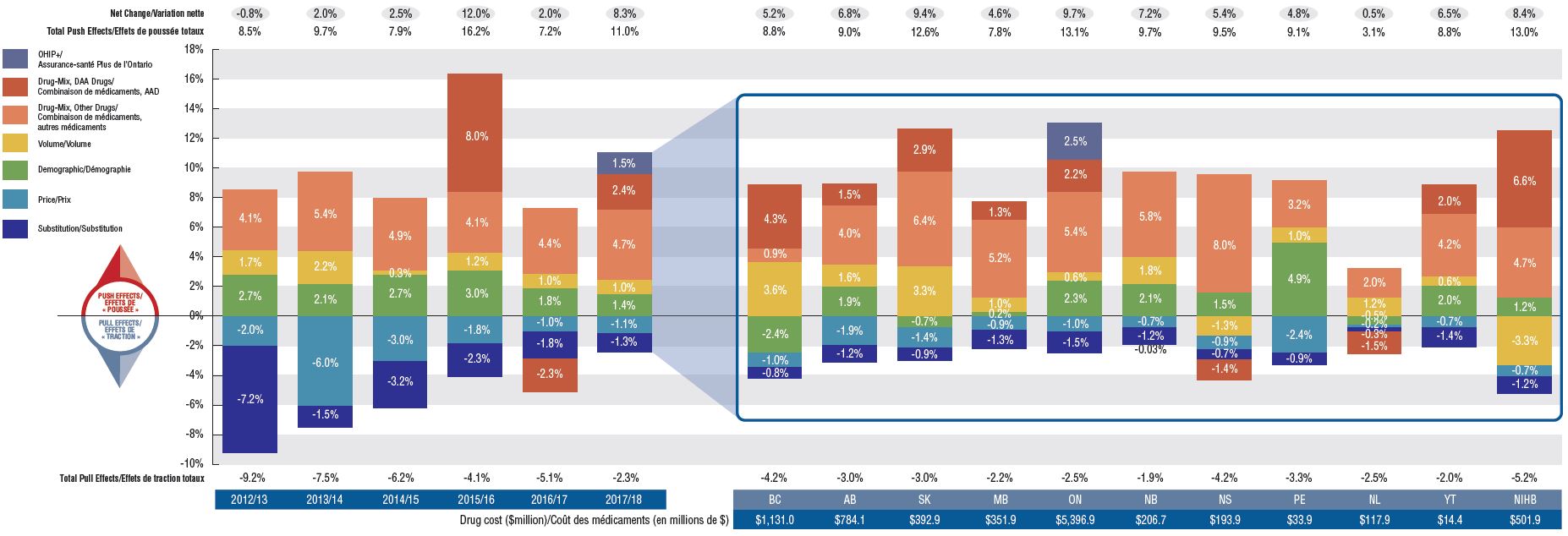
Figure description
The first section of this column graph describes the factors that impacted the yearly rates of change in drug costs across all NPDUIS public drug plans from 2012/13 to 2017/18: demographic, volume, drug-mix, price, and substitution effects. A percent change is assigned to each. The drug-mix effect for direct-acting antiviral hepatitis C drugs is isolated because of its high impact. Likewise, the effect of Ontario’s OHIP+ initiative has been isolated for 2017/18. The total positive or push effects; negative or pull effects; and net change is given for each year. The second section breaks down the overall results for 2017/18 by jurisdiction. The total drug cost for each plan is also given for 2017/18.
Section 1: Cost drivers from 2012/13 to 2017/18
| Effect |
2012/13 |
2013/14 |
2014/15 |
2015/16 |
2016/17 |
2017/18 |
| OHIP+ |
– |
– |
– |
– |
– |
1.5% |
| Drug-Mix, Direct-Acting Antiviral Drugs |
– |
– |
– |
8.0% |
-2.3% |
2.4% |
| Drug-Mix, Other Drugs |
4.1% |
5.4% |
4.9% |
4.1% |
4.4% |
4.7% |
| Volume |
1.7% |
2.2% |
0.3% |
1.2% |
1.0% |
1.0% |
| Demographic |
2.7% |
2.1% |
2.7% |
3.0% |
1.8% |
1.4% |
| Price |
-2.0% |
-6.0% |
-3.0% |
-1.8% |
-1.0% |
-1.1% |
| Substitution |
-7.2% |
-1.5% |
-3.2% |
-2.3% |
-1.8% |
-1.3% |
| Total Pull Effects |
-9.2% |
-7.5% |
-6.2% |
-4.1% |
-5.1% |
-2.3% |
| Total Push Effects |
8.5% |
9.7% |
7.9% |
16.2% |
7.2% |
11.0% |
| Net Change |
-0.8% |
2.0% |
2.5% |
12.0% |
2.0% |
8.3% |
Section 2: Cost drivers by jurisdiction for 2017/18
| Effect |
British Columbia |
Alberta |
Saskatchewan |
Manitoba |
Ontario |
New Brunswick |
Nova Scotia |
Prince Edward Island |
Newfoundland and Labrador |
Yukon |
Non-Insured Health Benefits |
| OHIP+ |
– |
– |
– |
– |
2.5% |
– |
– |
- |
– |
- |
- |
| Drug-Mix, Direct-Acting Antiviral Drugs |
4.3% |
1.5% |
2.9% |
1.3% |
2.2% |
– |
-1.4% |
– |
-1.5% |
2.0% |
6.6% |
| Drug-Mix, Other Drugs |
0.9% |
4.0% |
6.4% |
5.2% |
5.4% |
5.8% |
8.0% |
3.2% |
2.0% |
4.2% |
4.7% |
| Volume |
3.6% |
1.6% |
3.3% |
1.0% |
0.6% |
1.8% |
-1.3% |
1.0% |
1.2% |
0.6% |
-3.3% |
| Demographic |
-2.4% |
1.9% |
-0.7% |
0.2% |
2.3% |
2.1% |
1.5% |
4.9% |
-0.5% |
2.0% |
1.2% |
| Price |
-1.0% |
-1.9% |
-1.4% |
-0.9% |
-1.0% |
-0.7% |
-0.9% |
-2.4% |
-0.2% |
-0.7% |
-0.7% |
| Substitution |
-0.8% |
-1.2% |
-0.9% |
-1.3% |
-1.5% |
-1.2% |
-0.7% |
-0.9% |
-0.3% |
-1.4% |
-1.2% |
| Total Pull Effects |
-4.2% |
-3.0% |
-3.0% |
-2.2% |
-2.5% |
-1.9% |
-4.2% |
-3.3% |
-2.5% |
-2.0% |
-5.2% |
| Total Push Effects |
8.8% |
9.0% |
12.6% |
7.8% |
13.1% |
9.7% |
9.5% |
9.1% |
3.1% |
8.8% |
13.0% |
| Net Change |
5.2% |
6.8% |
9.4% |
4.6% |
9.7% |
7.2% |
5.4% |
4.8% |
0.5% |
6.5% |
8.4% |
| Drug cost in millions of dollars |
$1,131.0 |
$784.1 |
$392.9 |
$351.9 |
$5,396.9 |
$206.7 |
$193.9 |
$33.9 |
$117.9 |
$14.4 |
$501.9 |
An increasing number of high-cost drugs are reimbursed, often treating small patient populations
In 2017/18, NPDUIS public plans reimbursed 99 drugs with average annual costs per active beneficiary exceeding $10,000, a significant increase from 62 drugs six years before. These drugs, which accounted for close to a third of total drug costs, were attributed to a very small percentage of active beneficiaries (1.7%). Although there has been a sustained growth in the costs of all high-cost drugs in recent years, the steepest increase has been in the highest-cost band ($50K+).
Trends in high-cost drugs, 2012/13 to 2017/18
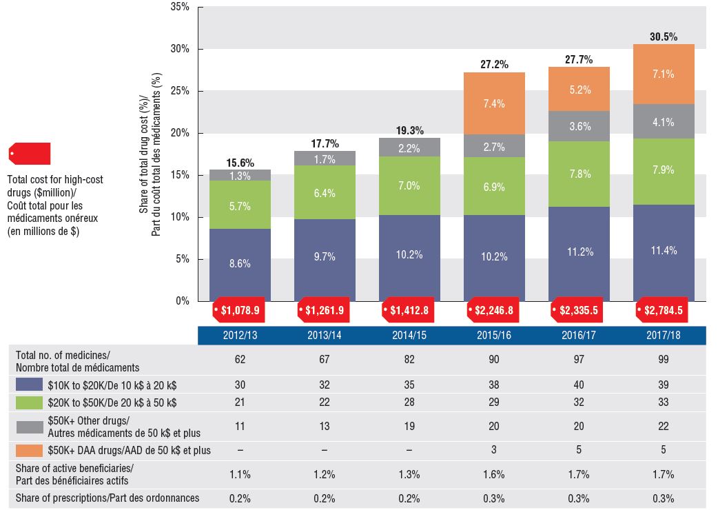
Figure description
This stacked column graph and accompanying table give the trends in high-cost drugs from 2012/13 to 2017/18. A graph reports the share of drug costs for high-cost drugs broken out by average cost per active beneficiary: $10,000‒20,000; $20,000–$50,000 and greater than $50,000. The share of new direct-acting antiviral drugs for hepatitis C is reported separately. The table gives the total number of high-cost molecules, the number of molecules in each cost band, the share of beneficiaries using these drugs, and the share of prescriptions that they represent.
High-cost drug share of total drug costs
|
2012/13 |
2013/14 |
2014/15 |
2015/16 |
2016/17 |
2017/18 |
| Total number of molecules |
62 |
67 |
82 |
90 |
97 |
99 |
| Total drug cost for all high-cost drugs in millions of dollars |
$1,078.9 |
$1,261.9 |
$1,412.8 |
$2,246.8 |
$2,335.5 |
$2,784.5 |
| Average cost per active beneficiary of $10,000‒20,000: share of total drug cost |
8.6% |
9.7% |
10.2% |
10.2% |
11.2% |
11.4% |
| Average cost per active beneficiary of $10,000‒20,000: number of molecules |
30 |
32 |
35 |
38 |
40 |
39 |
| Average cost per active beneficiary of $20,000–$50,000: share of total drug cost |
5.7% |
6.4% |
7.0% |
6.9% |
7.8% |
7.9% |
| Average cost per active beneficiary of $20,000–$50,000: number of molecules |
21 |
22 |
28 |
29 |
32 |
33 |
| Average cost per active beneficiary of greater than $50,000: share of total drug cost for direct-acting antiviral drugs |
– |
– |
– |
7.4% |
5.2% |
7.1% |
| Average cost per active beneficiary of greater than $50,000: number of molecules for direct-acting antiviral drugs |
– |
– |
– |
3 |
5 |
5 |
| Average cost per active beneficiary of greater than $50,000: share of total drug cost for other drugs |
1.3% |
1.7% |
2.2% |
2.7% |
3.6% |
4.1% |
| Average cost per active beneficiary of greater than $50,000: number of molecules for other drugs |
11 |
13 |
19 |
20 |
20 |
22 |
| High-cost drugs – share of total drug cost |
15.6% |
17.7% |
19.3% |
27.2% |
27.7% |
30.5% |
| High-cost drugs - share of active beneficiaries |
1.1% |
1.2% |
1.3% |
1.6% |
1.7% |
1.7% |
| High-cost drugs - share of total prescriptions |
0.2% |
0.2% |
0.2% |
0.3% |
0.3% |
0.3% |
High-cost drugs are among the greatest contributors to the drug-mix effect
The shifting use from lower- to higher-cost drugs, other than those for hepatitis C, pushed up drug costs by 4.7% in 2017/18.
Ophthalmological drugs contributed both positively (Eylea) and negatively (Lucentis) to the growth in drug costs, marked by an increased use of Eylea. Most of the other major contributors were high-cost oral oncology products and immunosuppressants. The remainder were used by larger beneficiary population to treat more common conditions.
Top drugs driving costs, 2017/18
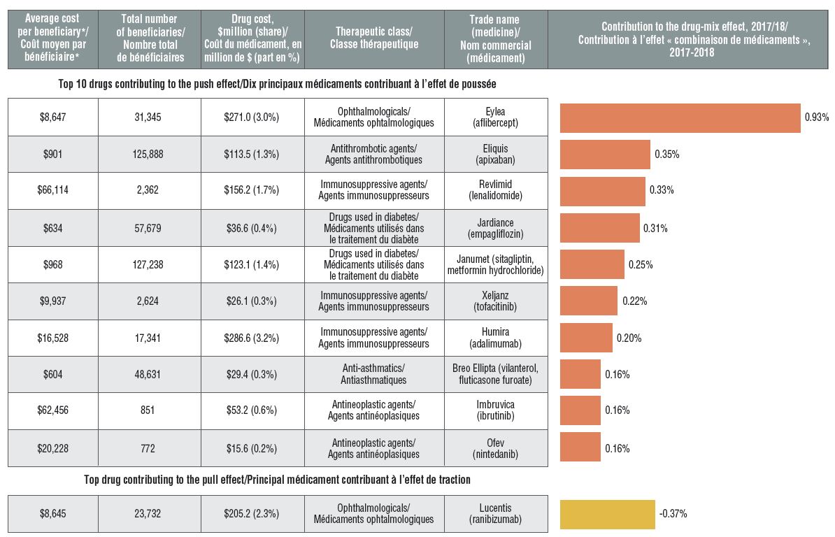
Figure description
A horizontal bar graph depicts the top 10 drugs contributing to the drug-mix push effect in the NPDUIS public drug plans in 2017/18 and the top drug contributing to the drug-mix pull effect. An accompanying table gives the average cost per beneficiary; total number of beneficiaries; drug cost in millions of dollars; share of the total drug cost; therapeutic class; and trade name and molecule for each drug.
| Average cost per beneficiary* |
Total number of beneficiaries |
Drug cost, in millions of dollars (share) |
Therapeutic class |
Trade name (medicine) |
Contribution to the drug-mix effect, 2017/18 |
| Top 10 drugs contributing to the push effect |
| $8,647 |
31,345 |
$271.0 (3.0%) |
Ophthalmologicals |
Eylea (aflibercept) |
0.93% |
| $901 |
125,888 |
$113.5 (1.3%) |
Antithrombotic agents |
Eliquis (apixaban) |
0.35% |
| $66,114 |
2,362 |
$156.2 (1.7%) |
Immunosuppressive agents |
Revlimid (lenalidomide) |
0.33% |
| $634 |
57,679 |
$36.6 (0.4%) |
Drugs used in diabetes |
Jardiance (empagliflozin) |
0.31% |
| $968 |
127,238 |
$123.1 (1.4%) |
Drugs used in diabetes |
Janumet (sitagliptin, metformin hydrochloride) |
0.25% |
| $9,937 |
2,624 |
$26.1 (0.3%) |
Immunosuppressive agents |
Xeljanz (tofacitinib) |
0.22% |
| $16,528 |
17,341 |
$286.6 (3.2%) |
Immunosuppressive agents |
Humira (adalimumab) |
0.20% |
| $604 |
48,631 |
$29.4 (0.3%) |
Anti-asthmatics |
Breo Ellipta (vilanterol, fluticasone furoate) |
0.16% |
| $62,456 |
851 |
$53.2 (0.6%) |
Antineoplastic agents |
Imbruvica (ibrutinib) |
0.16% |
| $20,228 |
772 |
$15.6 (0.2%) |
Antineoplastic agents |
Ofev (nintedanib) |
0.16% |
| Top drug contributing to the pull effect |
| $8,645 |
23,732 |
$205.2 (2.3%) |
Ophthalmologicals |
Lucentis (ranibizumab) |
-0.37% |
* The average cost per beneficiary may not represent the cost of a complete year of treatment.
Biosimilar uptake remains modest as new patients start on alternative originator medicines
Compared to traditional generic drug markets, the savings offered by biosimilars have been limited by a slower uptake and less pronounced price reductions. An assessment of patients initiated on non-conventional disease-modifying antirheumatic drugs (DMARDs) in the public plans shows that following the introduction of Inflectra, half of the expected new patients were initiated on infliximab, and of those, only half started on the biosimilar. Xeljanz, a new targeted synthetic drug, had the fastest-growing market share in the class, accounting for 16% of new patients in 2017/18 and largely occupying the share held by infliximab in previous years.
Distribution of non-conventional DMARDs use by new patients before and after Inflectra’s market entry in Canada, by drug, 2011/12 to 2017/18
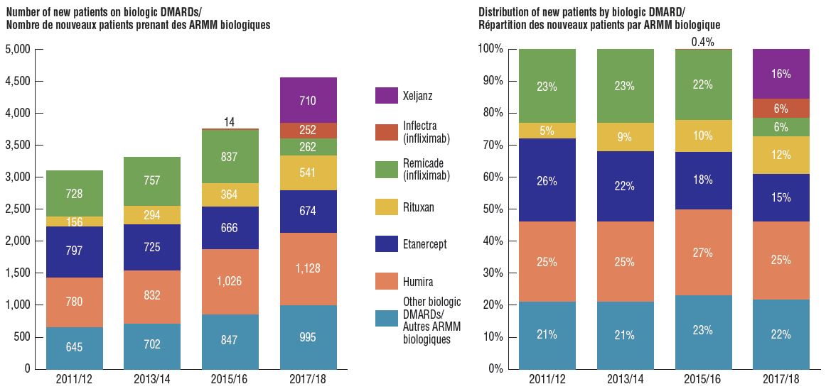
Figure description
Two stacked bar graphs break down the distribution of new patients started on a non-conventional disease-modifying antirheumatic by drug every second year from 2011/12 to 2017/18. The first graph gives the number of new patients started on each drug, while the second gives the distribution of new patients as a share of all non-conventional disease-modifying antirheumatics.
| |
2011/12 |
2013/14 |
2015/16 |
2017/18 |
| Xeljanz: number of new patients |
– |
– |
– |
710 |
| Xeljanz: distribution of new patients |
– |
– |
– |
16% |
| Inflectra (infliximab): number of new patients |
– |
– |
14 |
252 |
| Inflectra (infliximab): distribution of new patients |
– |
– |
0.4% |
6% |
| Remicade (infliximab): number of new patients |
728 |
757 |
837 |
262 |
| Remicade (infliximab): distribution of new patients |
23% |
23% |
22% |
6% |
| Rituxan: number of new patients |
156 |
294 |
364 |
541 |
| Rituxan: distribution of new patients |
5% |
9% |
10% |
12% |
| Etanercept: number of new patients |
797 |
725 |
666 |
674 |
| Etanercept: distribution of new patients |
26% |
22% |
18% |
15% |
| Humira: number of new patients |
780 |
832 |
1,026 |
1,128 |
| Humira: distribution of new patients |
25% |
25% |
27% |
25% |
| Other biologic DMARDs: number of new patients |
645 |
702 |
847 |
995 |
| Other biologic DMARDs: distribution of new patients |
21% |
21% |
23% |
22% |
Note: Other biologic DMARDs included Simponi, Orencia, Actemra, and Cimzia.
Note: The cost driver analysis follows the approach detailed in the PMPRB report The Drivers of Prescription Drug Expenditures: A Methodological Report, 2013.
Data source: NPDUIS Database, Canadian Institute for Health Information.